


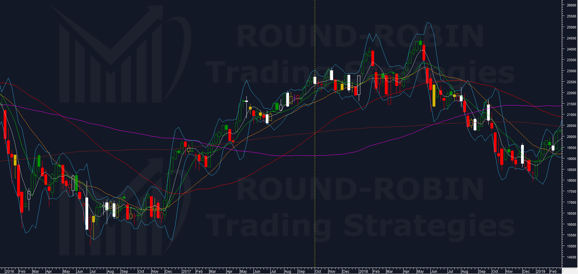
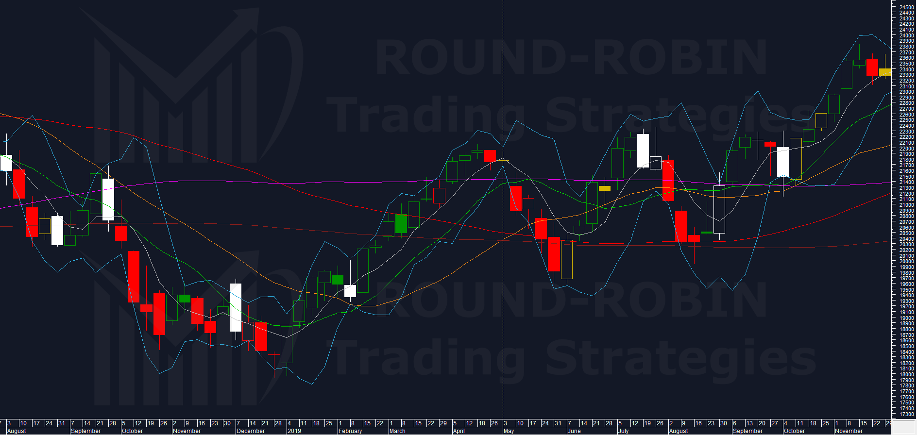
Weekly tracking of Italy’s benchmark index. Why we do this? Check our strategy page.
My proprietary DBBT indicator identifies misalignments between current price and expected technical level across major indices. Each week, we put the FTSE MIB in our crosshairs.
The hunt is on.
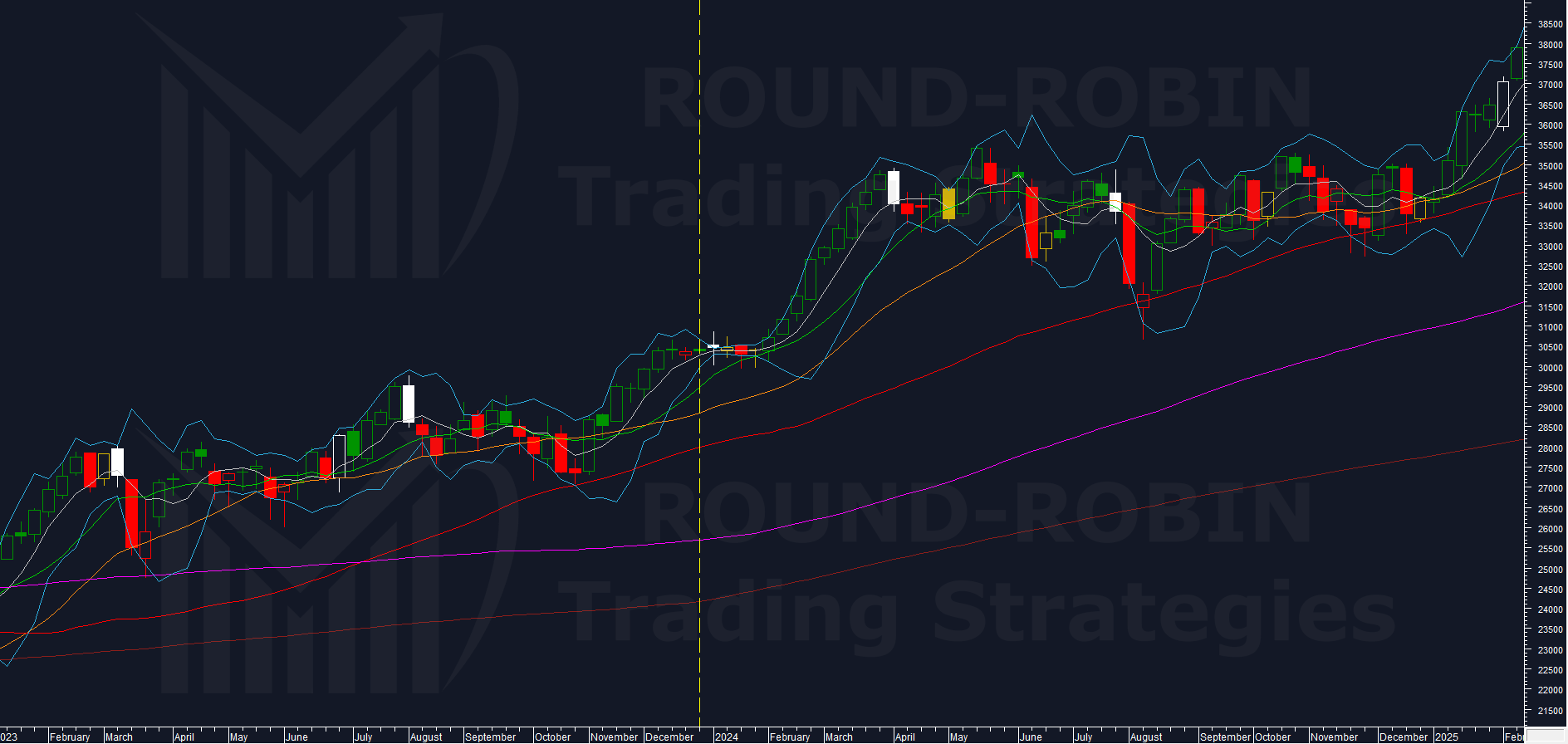
The Big Picture
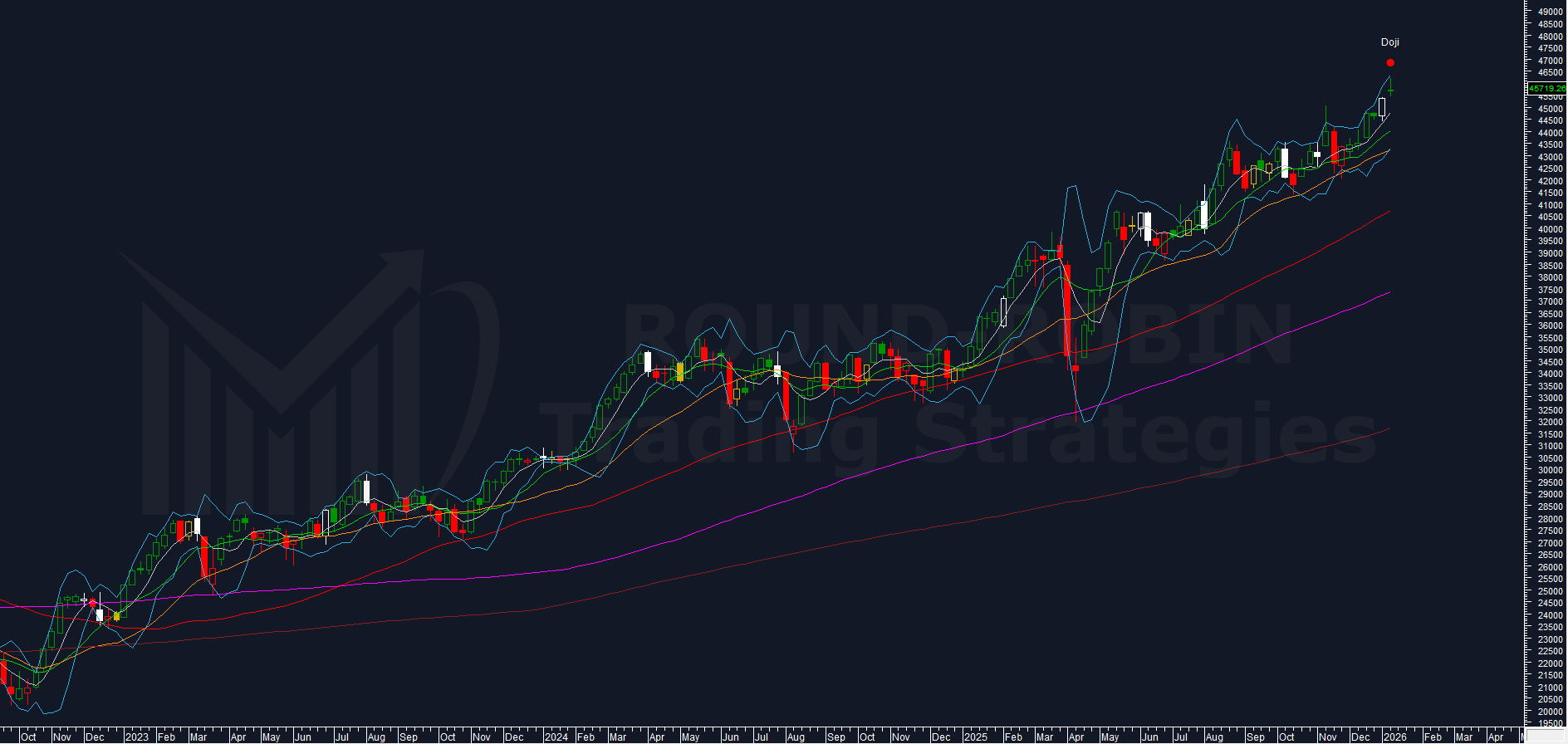
The FTSE MIB weekly chart speaks for itself: bull market.
Technical doubts: zero.
The only relevant correction came in March-April 2025 — erased with a V-shape recovery. Every other dip was quickly absorbed into sideways consolidation at highs before the trend resumed.
The key read from this chart:
All moving averages are rising and perfectly aligned by the textbook. Price sits above MA5W (white) > MA10W (green) > MA20W (orange) > MA50W (red) > MA100W (purple) > MA200W (amaranth).
Zero doubt — this is a bull chart. If your time frame is short-term, trying to guess when the trend reverses is largely futile.
The Objections
Permabear voice: “There’s clearly a doji this week.”
Yes. But look at the chart: throughout this bull market, a doji has never anticipated a trend inversion. That doesn’t mean it can’t happen starting Monday. It means we have no historical basis to rely on it.
Permabear voice: “This doji comes with a gap up.”
Correct. And this combination — gap-up doji at new highs — hasn’t occurred in over two years of bull market.
When was the last instance? December 2020.
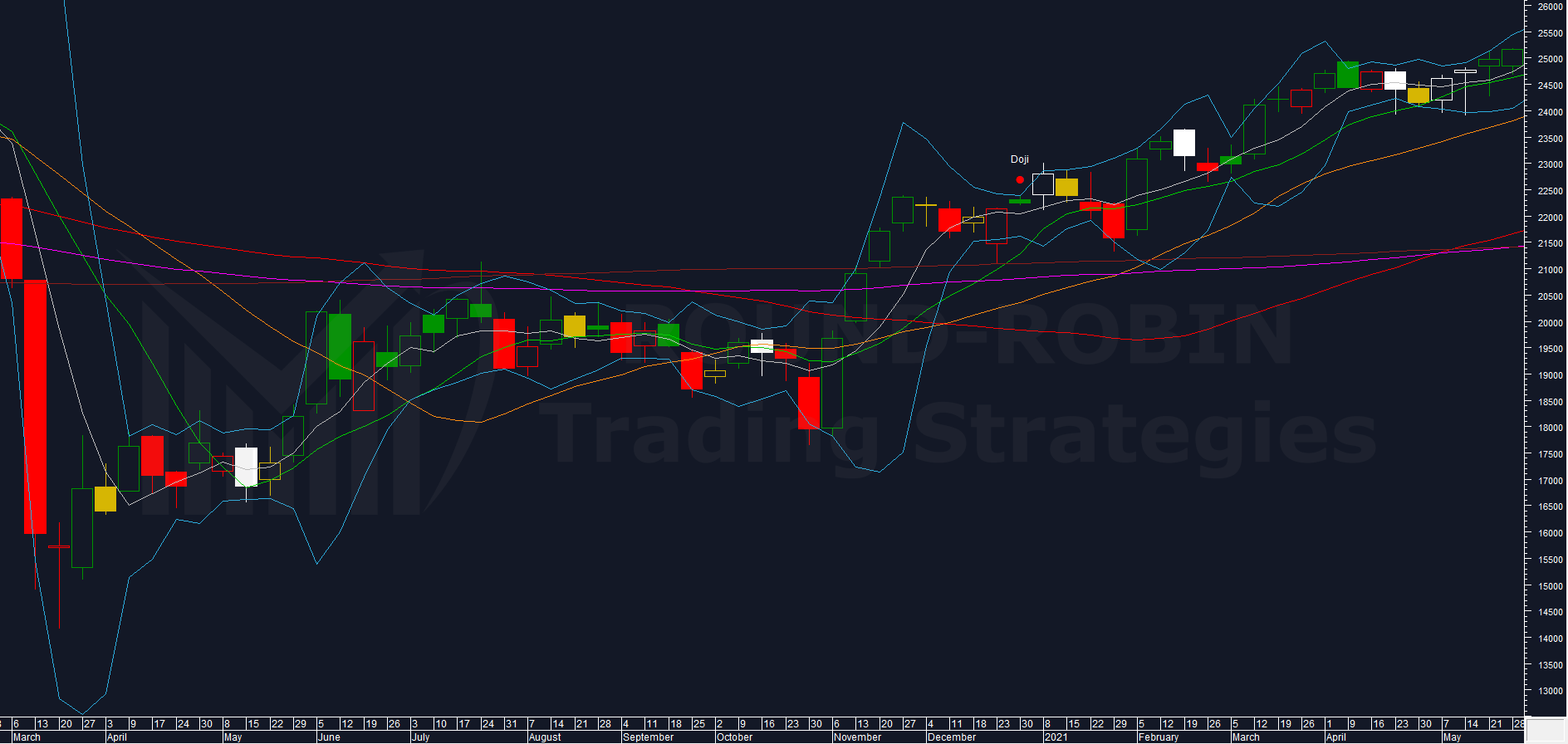
The doji closed at 22.232,90. The subsequent week printed a top at 23.003,56 — a +3,5% move — before reversing. The gap filled within three weeks. By the fourth week, price bottomed at 21.311,51, a -4,1% decline from the doji close.
The pattern showed itself to be toppish.
How rare is this setup? Before the two post-COVID occurrences, it appeared zero times in data going back to 1998. A “zero-chance” event in 20+ years showed up twice in under five years.
The take: This is not statistics — it’s closer to cabalistic observation. But the precedent exists: the same outcome could repeat. A strategist’s response could be: reduce long exposure for 3-4 weeks. If price breaks below this week’s low (45.400), selling OTM calls enters the picture. There is no evidence of a major inversion — only a potential stall.
A Note on Method
The gap-up doji tells us the spin could slow down.
Is that enough? No.
So we look for supporting evidence?
This is one of the most severe analytical mistakes.
Data must be analyzed for what stands out — not for what supports our partial observations, our hunches, or worse, our biases.
What Stands Out
Is there anything excessive in duration or magnitude? Not yet. MA50W and MA100W are approaching levels that slowed the market in November 2025, but those moving averages speak to a different timeframe than the December 2020 analog.
No confirmation here. We move on.
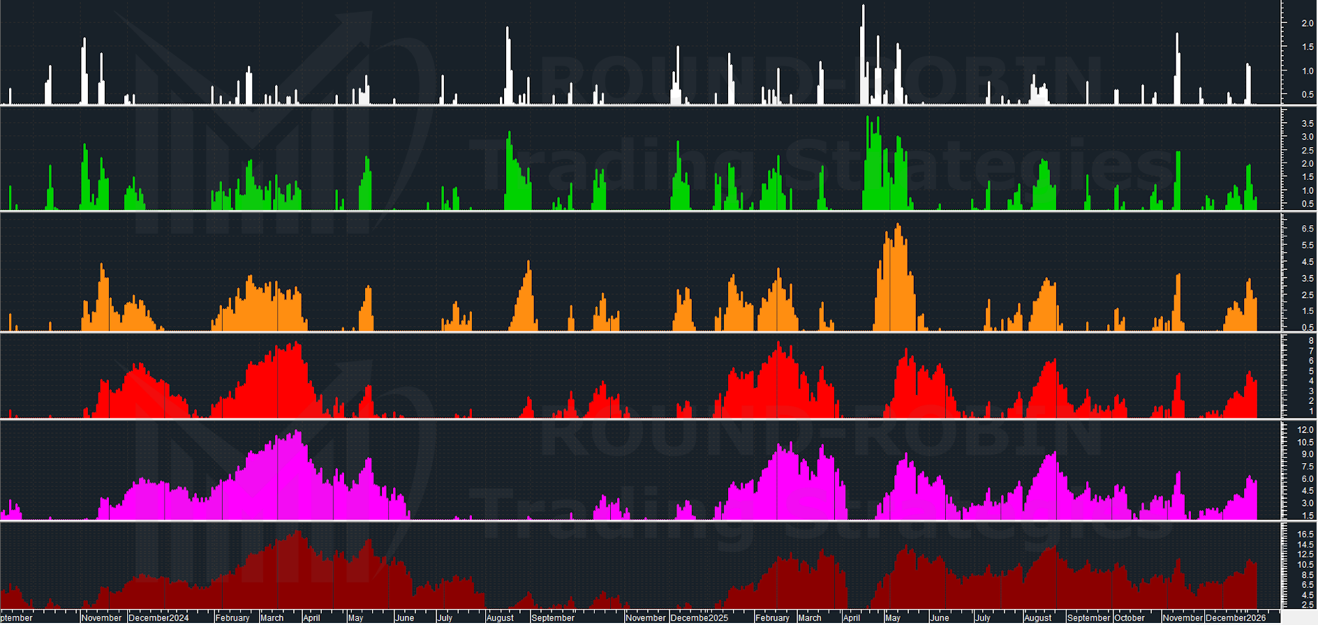
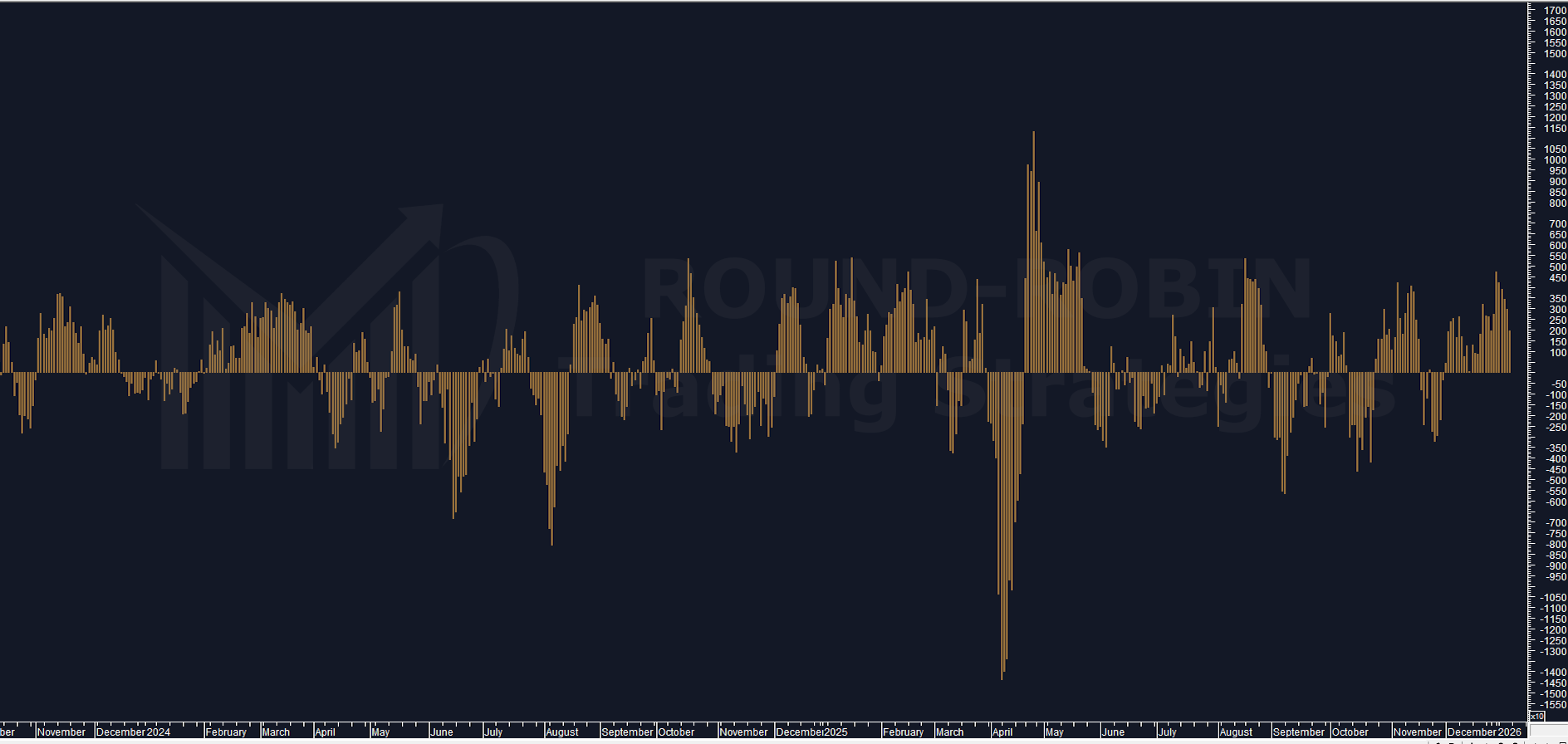
Weekly Range %
Weekly Range % measures the week’s high relative to its low, expressed as a percentage. Simple.
What matters now: the 5-week moving average (MA5W, white) sits below 2%. The historical floor we’re watching is approximately 1,5% — the level touched in December 2023, May 2019, and October 2017.
Holiday weeks naturally compress range. But when MA5W approaches this floor during a bull market at new highs, history has something to say.
Three prior instances. Let’s examine what followed.
October 2017
Was the trend bullish? Yes. Was price at new highs? Yes. What followed: Sideways for several weeks. Strategical read: Compatible with reducing long exposure / covering with short OTM calls.
May 2019
Was the trend bullish? Yes. Was price at new highs? Yes — two weeks prior, near the top. What followed: Bearish, approx one-month correction. Strategical read: Compatible with reducing long exposure / covering with short OTM calls.
December 2023
Was the trend bullish? Yes. Was price at new highs? Yes. What followed: Sideways for five weeks. Strategical read: Compatible with reducing long exposure / covering with short OTM calls.
Convergence
Three historical instances of Weekly Range % MA5W hitting lows during a bull market at new highs. All three preceded either sideways consolidation or correction.
This aligns with what the gap-up doji is signalling: the FTSE MIB probably won’t advance much further — if at all — in the near term.
Probably. That word is always the keyword for decent money management.
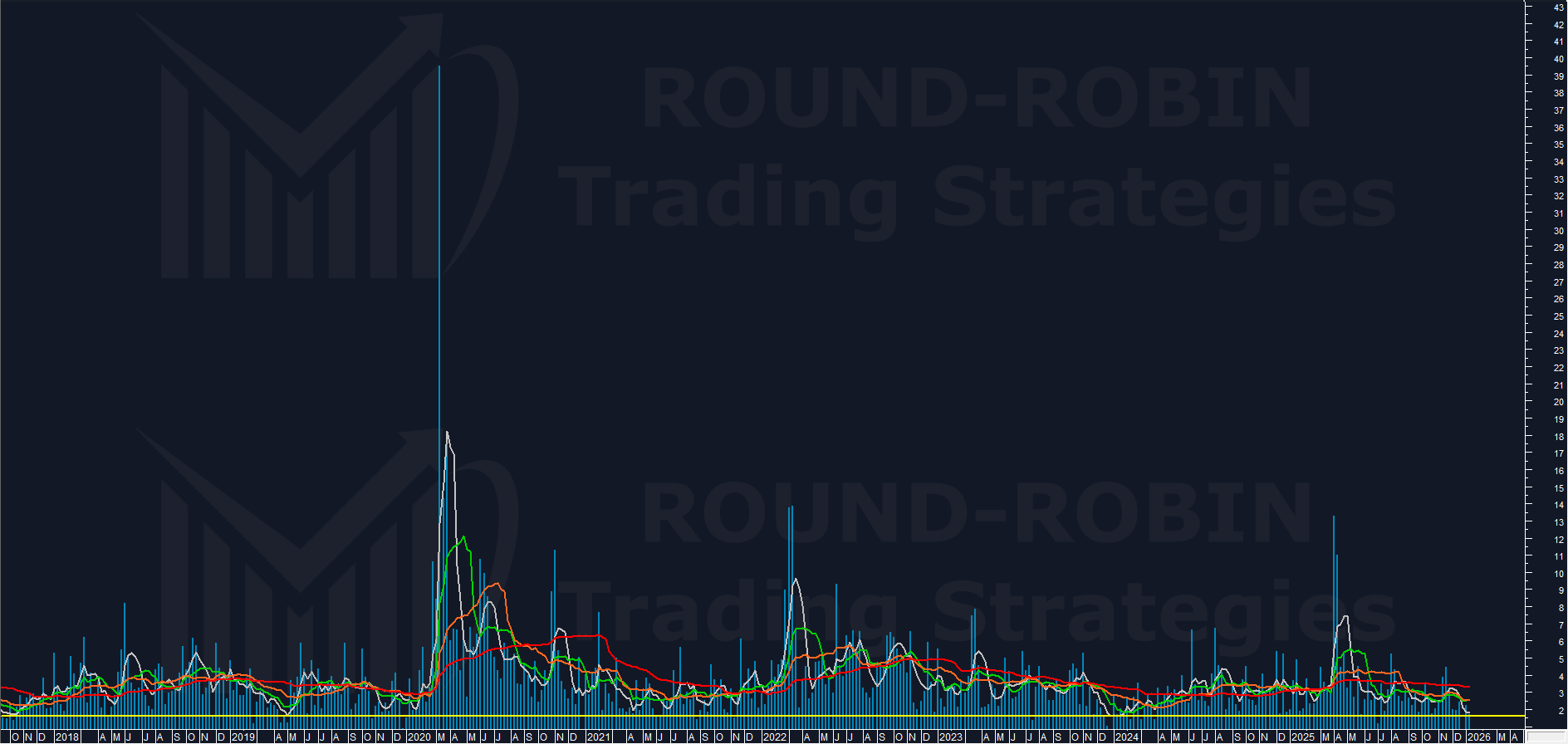
PowerBull vs PowerBear
This proprietary indicator shows bulls losing momentum after peaking — a pattern that has consistently preceded price stalls. The implication: bullish pressure is fading. If buyers can still push higher, they won’t go far.
This is numbers talking, not prophecy. Nothing is written in stone.
When This Approach Tells Us We’re Wrong
No statistical framework is complete without defining failure conditions.
If you reduced long exposure: New highs persisting for 2-3 weeks signal the thesis was incorrect. The expected deceleration didn’t materialise.
If you covered with short OTM calls: The strike moving ATM is a warning. The strike moving ITM means you’re wrong — close the position.
The time horizon: We expect 3-4 weeks of stalled momentum. If after this window the market remains above the gap, that’s a significant warning. Unless your short call position is still deep OTM, reassess the entire thesis.
Conclusion
Bull market with signs of deceleration that could persist for the next 3-4 weeks.
What does the framework suggest? Reducing long exposure fits the statistical picture. If price breaks below this week’s low (45.400), covering with short OTM calls becomes a consideration. The data points to a probable pause — not yet that major trend inversion we’re hunting with the DBBT.
Unfamiliar with terms like gap or doji? We cover technical concepts every Monday in Pattern Decoded (theory) and every Wednesday in Pattern Spotted (applied examples). Options strategies are part of our advanced Trading Academy program — launching soon.
Leave a Reply