


Pattern Decoded is our Monday format where we analyze the most well-known patterns in technical analysis.
This week we cover the Rising Wedge – the ascending wedge everyone thinks they understand.
The Rising Wedge is the pattern that deceives the most.
Price rises, lows rise, highs rise – everything signals a healthy trend.
But beneath the surface, each thrust is shorter than the previous one.
The range compresses.
Buyers are still there, but each time with less conviction.
A silent agony: the trend does not break – it empties.
And the insidious part is precisely this – as long as you are in the trade, everything still appears to be working.
Anatomy of the pattern
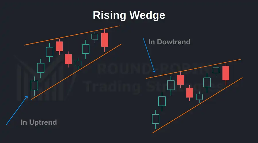
chart: Rising Wedge
Two ascending trendlines that converge.
The lower one rises more steeply than the upper one.
Price bounces between the two, forming higher highs and higher lows – but the space between each bounce progressively narrows.
This is the core of the pattern: it is not a parallel channel, it is not a symmetrical triangle.
The two lines move in the same direction, but at different speeds.
The lower trendline chases the upper one.
When it catches up, there is no room left to move higher.
Visually it resembles a wedge – hence the name – narrowing upward.
An inverted funnel in which price is compressed until the breakout point.
What happens beneath the surface
Why does a Rising Wedge form?
The answer lies in the psychology of market participants.
The trend is bullish.
Buyers keep entering, but each new wave of buying produces a high only marginally above the previous one.
Sellers are not yet attacking – it is simply that buyers are doing so with progressively less aggression.
Volume tells the same story.
In the vast majority of cases it declines throughout the formation of the pattern.
There is no sell-off, no panic.
It is something more subtle: demand is drying up.
The result is a fragile equilibrium.
It takes very little to break it – and when it breaks, those still long find themselves on the wrong side without having received a clear warning.
How to identify it – without cheating
Many traders see Rising Wedges everywhere.
Two rising, converging trendlines, and they call it done.
It is not that simple – precise criteria are required to distinguish a wedge from a pennant, a channel, or simple consolidation.
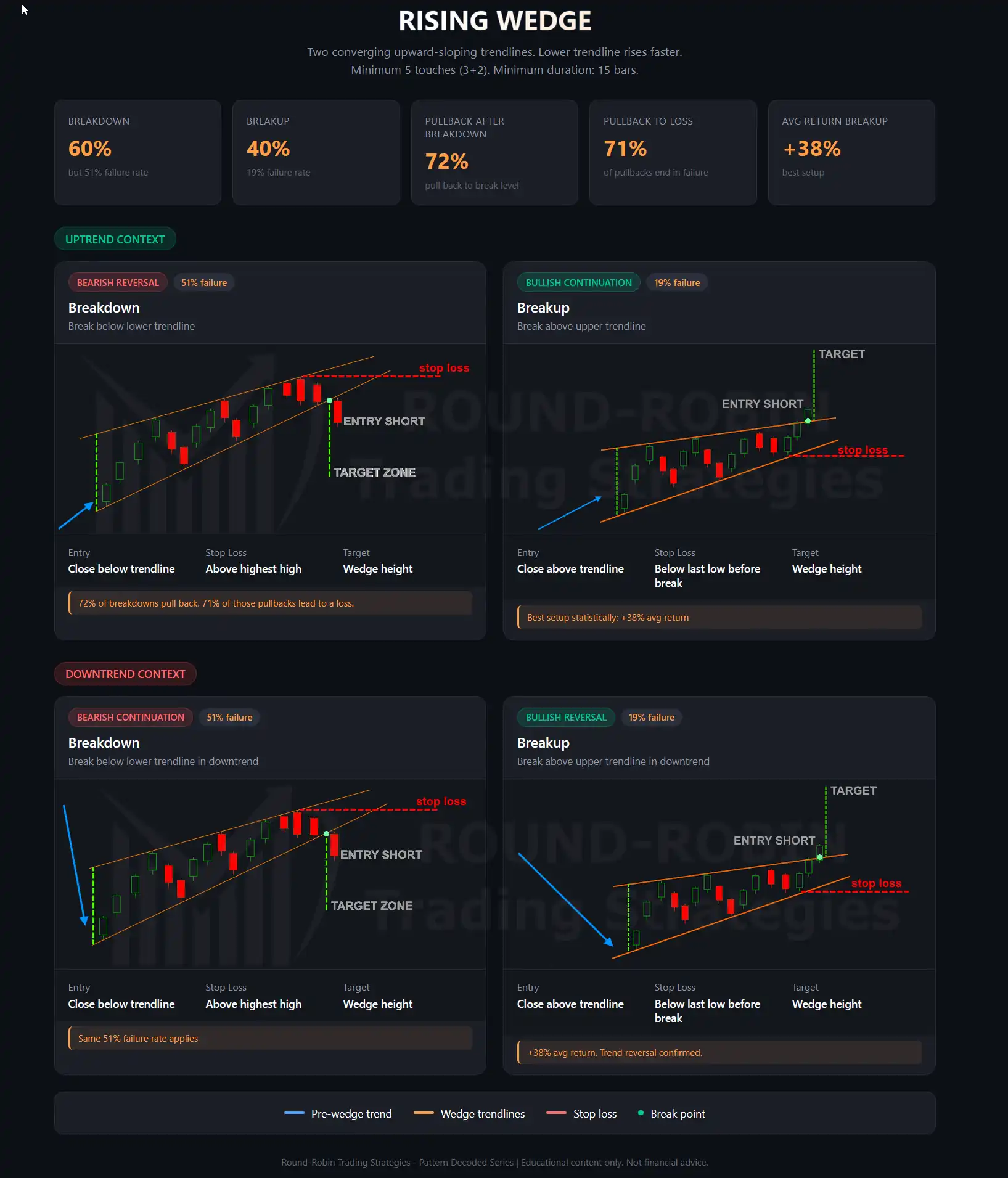
The first requirement is structure: at least five touch points between the two trendlines are needed – three on one, two on the other.
Fewer than five and you are looking at something else.
Both trendlines must rise, but not at the same pace.
The lower one – the dynamic support – rises more steeply than the upper one.
This is what creates the convergence.
If they rise in parallel, it is an ascending channel, not a wedge.
Minimum duration: Bulkowski’s 2021 study, conducted on over 1,400 Rising Wedges using daily data from US equities, sets the minimum at 15 bars.
Below this threshold, the formation has not had enough time to express the exhaustion process described above.
The principle adapts to the timeframe in use: 15 daily bars, 15 weekly bars, 15 hourly bars – the time horizon changes, the logic does not.
Volume should decline throughout the formation.
This occurs in approximately eight out of ten cases.
If volume increases as the wedge develops, the structure is suspect – it may be a trend channel with momentum still intact.
Finally, the direction of the breakout.
A downside breakdown occurs in 60% of cases.
But there is a paradox worth knowing: upside breakouts, when they occur, historically produce superior performance.
The wedge that breaks to the upside is rarer, but those who ride it benefit more.
The same study confirms this asymmetry – and also confirms that the breakdown, despite being more frequent, carries a high failure rate (51% break-even failure rate).
Which means only one thing: without confirmation and without context, drawing two converging lines is not enough.
Two patterns in one
Textbooks classify the Rising Wedge in two ways: a reversal pattern when it forms within an uptrend, a continuation pattern when it forms within a downtrend.
In both cases the signal is bearish – only the context changes.
It is a clean distinction, easy to teach.
But the numbers complicate it.
Bulkowski’s study does not separate statistics by trend context.
The data available – 51% failure rate on the breakdown, significantly better performance on upside breakouts – are aggregated.
We do not know how much of the failure belongs to wedges in uptrends and how much to those in downtrends.
This is a significant limitation of the available literature, and it makes the reversal/continuation classification more of a didactic convention than a statistically demonstrable fact.
Our statistical approach differs from the textbook one, and we will explore it further with real cases in Pattern Spotted.
The textbook trade
The textbook trade on the Rising Wedge is straightforward.
Entry occurs on a confirmed close beyond one of the two trendlines.
In the most frequent case – the breakdown – one enters short when price closes below the dynamic support.
In the opposite case, one enters long on a close above the dynamic resistance.
The stop loss is placed above the highest point of the wedge for short trades, below the lowest point for long trades.
Two methods exist for setting the target.
The first: measure the height of the wedge at its widest point and project the same distance from the breakout level.
The second, more conservative: the target corresponds to the deepest low within the formation.
Pattern Recognition: Rising Wedge
The minimum acceptable risk/reward ratio is 2:1.
If the wedge structure does not allow for it – because it is too narrow or because the stop is too far away – the trade is not taken.
One final data point: in 72% of cases, after the breakout price returns to test the breakout level.
Textbooks present this as neutral behavior – a simple retest before continuation, whether to the upside or downside.
The numbers tell a very different story.
We offer a reading of that 72% that no textbook explains.
Take 100 Rising Wedges that break to the downside:
- 72 will pull back to the breakout level
- 51 will fail entirely
- This means approximately 71% of pullbacks (51 out of 72) are not a healthy retest – the pattern is invalidating itself
Now take 100 Rising Wedges that break to the upside:
- 72 will throw back to the breakout level
- 19 will fail
- Only 26% of throwbacks (19 out of 72) lead to failure – in the remaining 74% of cases, the return to the level is a genuine retest before continuation
The 72% is the same number.
But applied to the breakdown it is a signal of weakness.
Applied to the upside breakout it is an entry opportunity.
Where the textbook gets it wrong
Open any trading social media account and you will find Rising Wedges drawn everywhere.
Two converging lines, a downward arrow, and the verdict: “everything is about to crash.”
It is the pattern of choice for bearish doomsayers.
The problem is that the numbers say the opposite of what these pseudo-analysts claim.
The breakdown – the downside break everyone waits for – fails in 51% of cases.
It holds the worst ranking among all 36 patterns studied by Bulkowski for downside breakouts.
The average post-breakout return is a meager -9%.
Anyone entering short on a Rising Wedge is trading the worst statistical setup available across the entire catalog of chart patterns.
The upside breakout – the one nobody considers because conventional wisdom says “the wedge is bearish” – carries a failure rate of 19% and an average return of +38%.
The Rising Wedge works best as a continuation pattern within an uptrend – price compresses, breaks to the upside, and the trend continues.
And it works as a reversal pattern within a downtrend – the bounce exhausts itself inside the wedge, breaks to the upside, and the trend changes direction.
Exactly the opposite of what is commonly taught.
This does not mean the breakdown never occurs – it does, in 60% of cases.
But occurring and generating a profit are two different things.
And the gap between a pattern that breaks to the downside and a profitable trade is the heart of a problem that most textbooks – and most social media accounts – prefer not to address.
Conclusion
The Rising Wedge is the most misunderstood pattern in technical analysis.
The data show that the breakdown is the worst setup among all chart patterns, and that the upside breakout – the one nobody looks for – is statistically superior.
Does this mean the breakdown should never be traded?
No.
It means that on its own it is a coin flip.
That 49% improves when the break of dynamic support coincides with the break of a moving average that has been historically significant for that market and that timeframe.
Or when an oscillator reaches levels that have historically preceded reversals for that specific asset.
The Rising Wedge should not be discarded.
It should be required not to stand alone.
In the next Pattern Spotted we will put it to the test on real charts, using our statistical approach.
Leave a Reply