


Weekly tracking of the Italian benchmark index. Why do we do this?
Check out our strategy page.
My proprietary DBBT indicator identifies misalignments between current price and expected technical levels on major indices. Every week, we put the FTSE MIB in our crosshairs.
The hunt is on.
The Big Picture
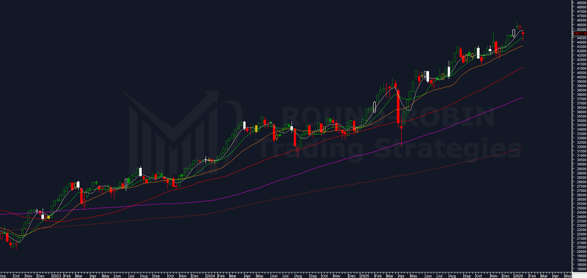
chart: FTSE MIB weekly
The FTSE MIB weekly chart shows us:
- a breakdown of the MA5W, with a weak price signal
- the second consecutive week of lower highs and lower lows that produced almost nothing: the candle body is completely contained within the candle from 3 weeks ago.
Let’s connect this to what we highlighted the previous week:
- A very low weekly range of 1.21%
- My volatility indicator showing compression at 4.41%
- An expected move within 3-4 weeks
Beginner’s voice: “Correct! This week it moved! The weekly percentage range (3.01%) is more than double the previous week and the market had 4 negative days out of 5.”
None of this is false, but it’s completely imprecise.
Never confuse a weekly timeframe analysis with a daily or worse with an intraday one
We’re analyzing and commenting on the FTSE MIB weekly chart. So where did the market actually go? Nowhere!
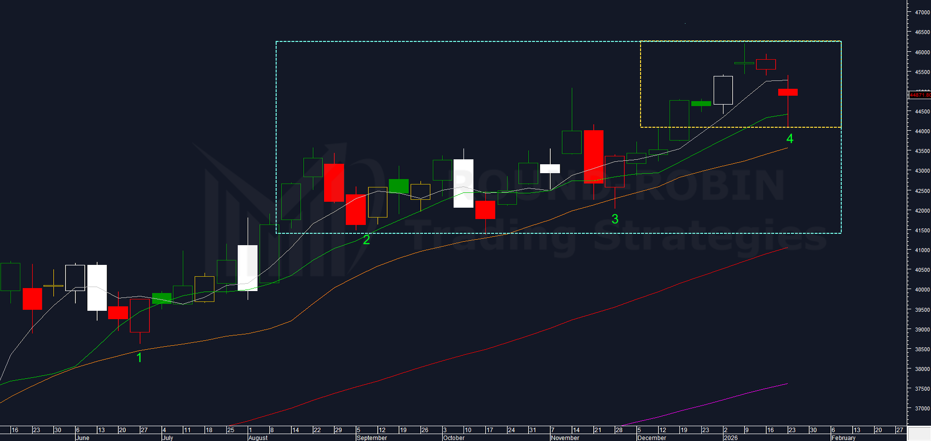
chart: FTSE MIB weekly medium term
Looking at this week, prices dropped sharply (-2.5% from the weekly low on the previous close), but ultimately the bounce was not much weaker than the bearish power at the start of the week.
Moreover, looking at the dashed yellow rectangle, you can see that the market is at the same levels as three, four, and five weeks ago. This shows compression.
If we look before these last 5 weeks, we can see a long sideways movement from August to December 2025 followed by a breakout without a clear price signal (there was no bullish candle that broke through the long upper shadow of the November high; prices exceeded it gradually).
This could indicate that the FTSE MIB is in a larger rectangle (blue), which appears enormous due to compression but actually has a range of just over 10%, therefore quite compatible with a potentially broader sideways pattern.
Another interesting insight comes from the pattern “two weeks we’ll let you have but then we (bulls) take command again”.
Probably a somewhat long name for a pattern, but it’s essentially what happened when two consecutive red candles formed (note: we use red candles to identify lower highs and lower lows).
In this medium-term trend, after two reds (see 1-2-3 green on the chart), the market has always turned bullish (3 out of 3). This week marked the fourth occurrence and the long lower shadow is an ominous sign for bears.
Bulls vs Bears
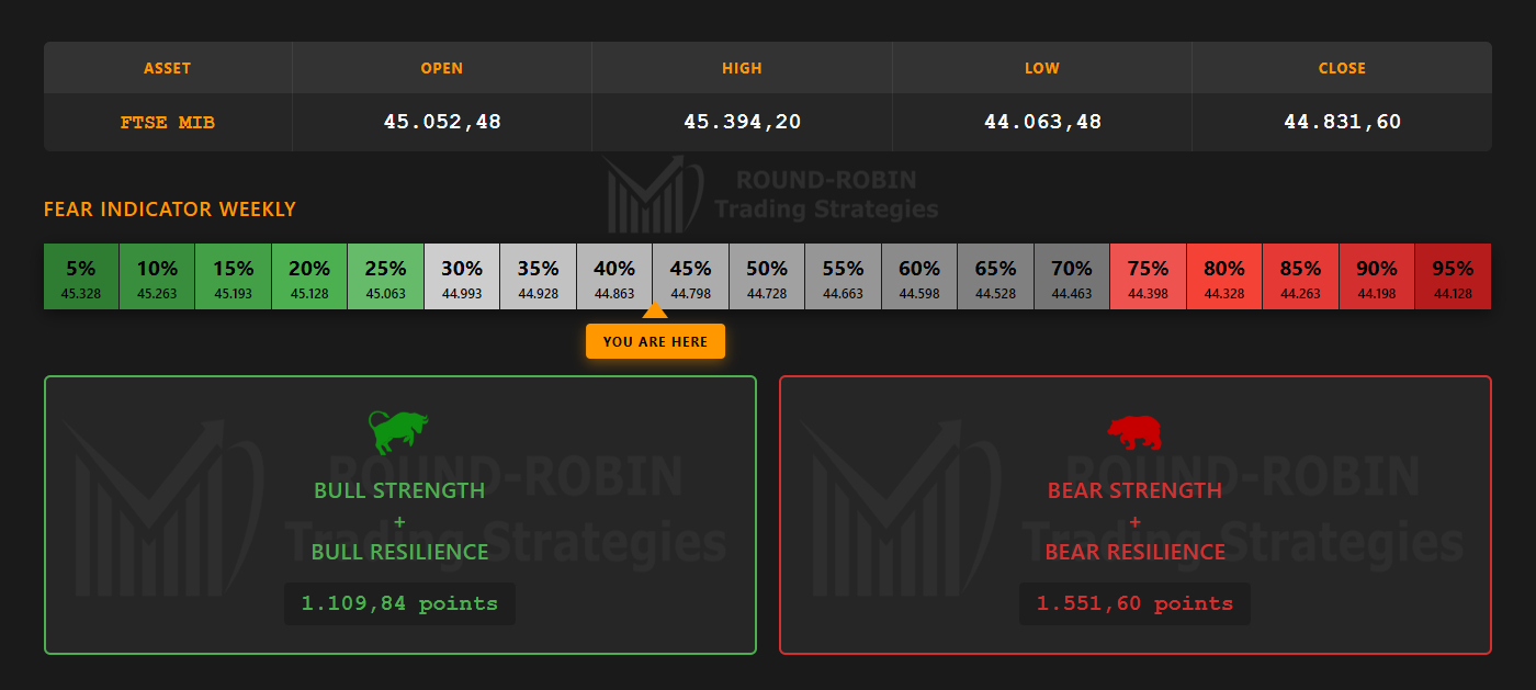
infographic: FTSE MIB Bulls vs Bears weekly
From Monday’s open to Friday’s close, the infographic tells the story.
The bears won by a small margin, but mathematically that’s the case.
The weekly fear indicator shows that so far it’s been all just noise.
But the bulls are on alert: with a level just above 40%, they’re not worried, but they have eyes and ears wide open.
The Compression
The compression hasn’t shown signs of explosiveness; rather, the up-and-down movement has actually accentuated it, as seen from my proprietary volatility indicator.
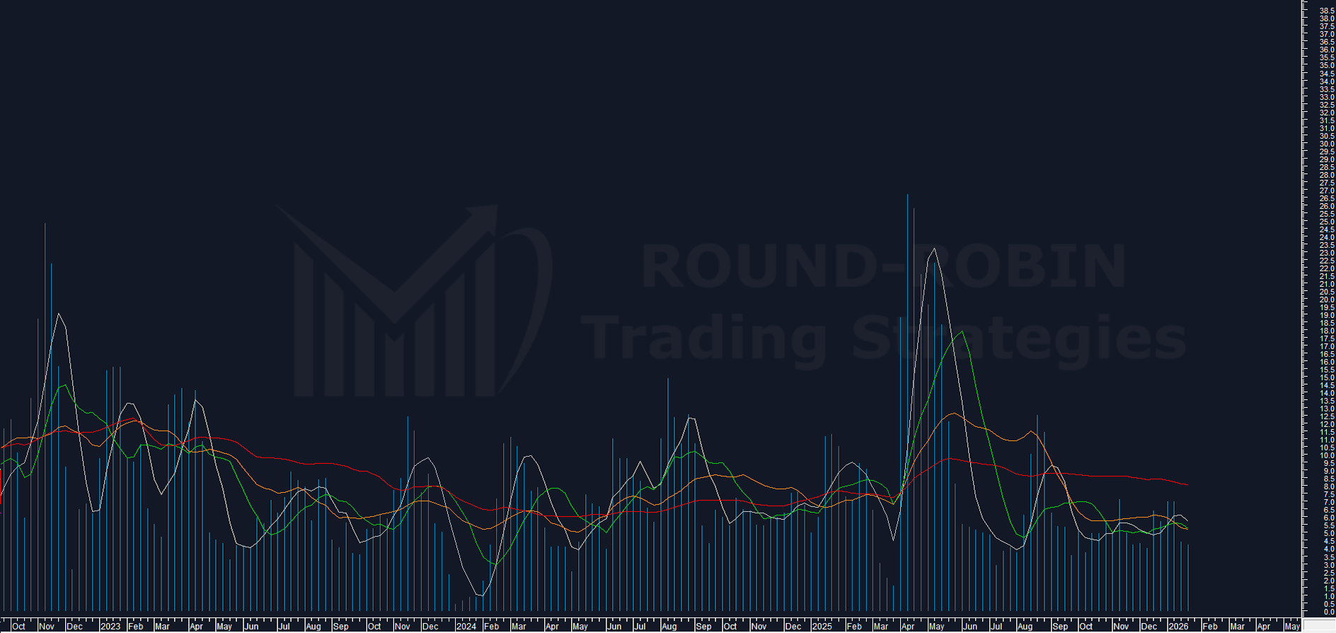
chart: proprietary volatility indicator weekly
From the previous week at 4.41% to this week at 4.26%, the FTSE MIB is slightly more compressed. Now even the 5-week moving average calculated on the indicator is pointing downward.
The week has certainly brought many doubts, and this could also fuel the intensification of compression and thus act as a brake on a directional move.
I don’t rule out a further drop in my indicator before seeing the spring explode, but for now I maintain the idea that within 3 weeks we’ll see either a clear bullish price signal confirming the break of the November 2025 highs, or the blue rectangle could become a new reference point for both bulls and bears.
Voice of the one who always wants to be clever: “Nice analysis, obviously it either goes up or down!”
Not so obvious, considering we’ve already seen that prices haven’t gone anywhere in the last five weeks and that from August to December 2025 they were in a limited range.
The bet isn’t whether it moves +/-1%, but whether it moves enough to make the options strategies we discussed last week profitable: long straddle, long strangle, long iron condor, all strategies that bet on an increase in volatility.
Other Elements to Watch
- Gap down opening immediately absorbed
- Close below the MA5W after 8 consecutive weeks above
- RSI as a complacency indicator
RSI as a Weekly “Trading System”
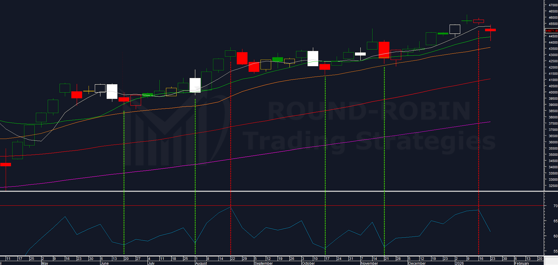
chart: RSI on FTSE MIB weekly
Since May 2025, the FTSE MIB has risen almost 25% with the RSI never reaching overbought territory. Not only that: it has always oscillated between 55 and 70.
Essentially, buying FTSE MIB when the weekly RSI is at 56 and selling it when it’s at 68-69 has been working very well as a “trading system”.
Last week it was 68.49 (so it was a sell signal), this week it’s at 60.97.
Conclusion
A week slightly in favor of the bears, compression persists (which will also be interesting on the daily chart at the start of next week).
No real price signal.
The last time the weekly RSI approached the overbought area, the FTSE MIB had two consecutive weeks down before rallying.
From a strategic perspective:
This week’s long lower shadow and the “two consecutive reds” pattern observed in this specific rally (3 out of 3 with subsequent bounce) are elements to consider before taking aggressive directional positions.
The potential blue rectangle (range of just over 10%) could be merely an optical illusion of compression, or it could become the new technical reference.
The compression (now at 4.26%) suggests that in the next 2-3 weeks we could witness a move of some significance.
The options strategy discussed last week — gradually entering volatility-buying strategies — maintains its logical validity in this context.
Where will the market go? We’ll find out together.
Leave a Reply